Categories
- Design Tips (1)
- Design Tutorials (1)
- Uncategorized (352)
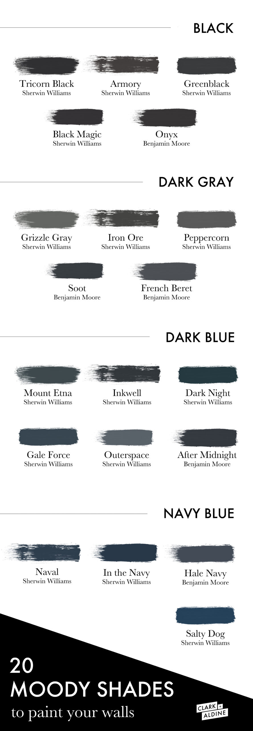
Paint is hands down my favorite and probably the quickest way to transform a space. I love how quickly and affordably this type of transformation can happen. Today’s post is all about moody paint colors. I’ve broken them down into four color categories: black, dark gray, dark blue and navy blues. I felt this made it easier for you to find colors you were looking for without limiting options.
Dark colors dissolve boundaries, I think this might be one of the many reasons I love them so much. You can use Moody dark colors to fill a space with confidence, energy and all the creativity. Moody paint can be used as an accent through trim or even ceiling color or by setting the entire room for a moody experience. Hello welcomed drama! Any way you go about moody paint truly sets the mood for the room. One I welcome into design.
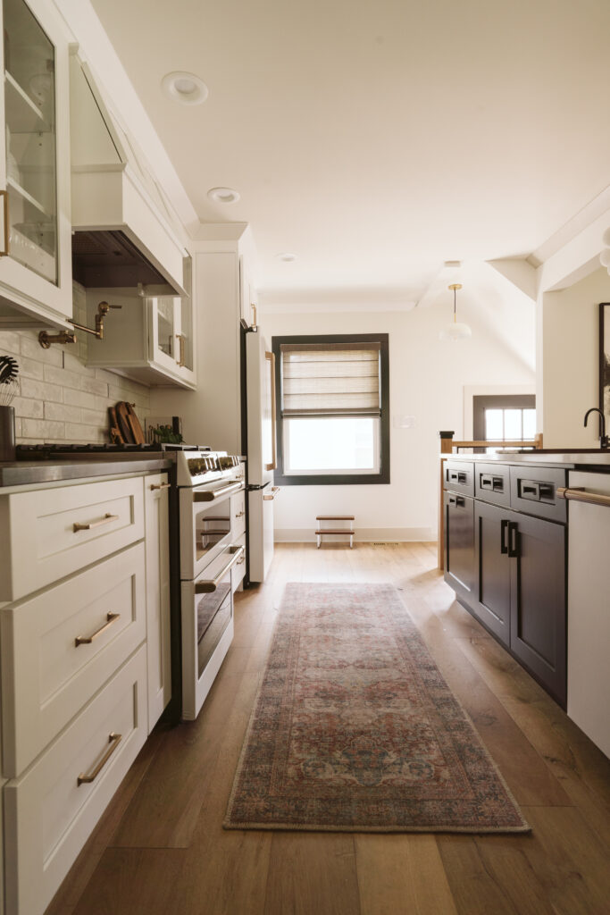
Here we used Sherwin Williams Greenblack to define the kitchen space through the window casing. Love how this creates its own space in an open space design.
Black doors are a good to statement for me. I love how classic and timeless they are. In my opinion a black door immediately sophisticates a space. My favorite black black is Sherwin Williams Tricorn Black! The French doors make my heart skip a beat and create the perfect entrance into a home office.
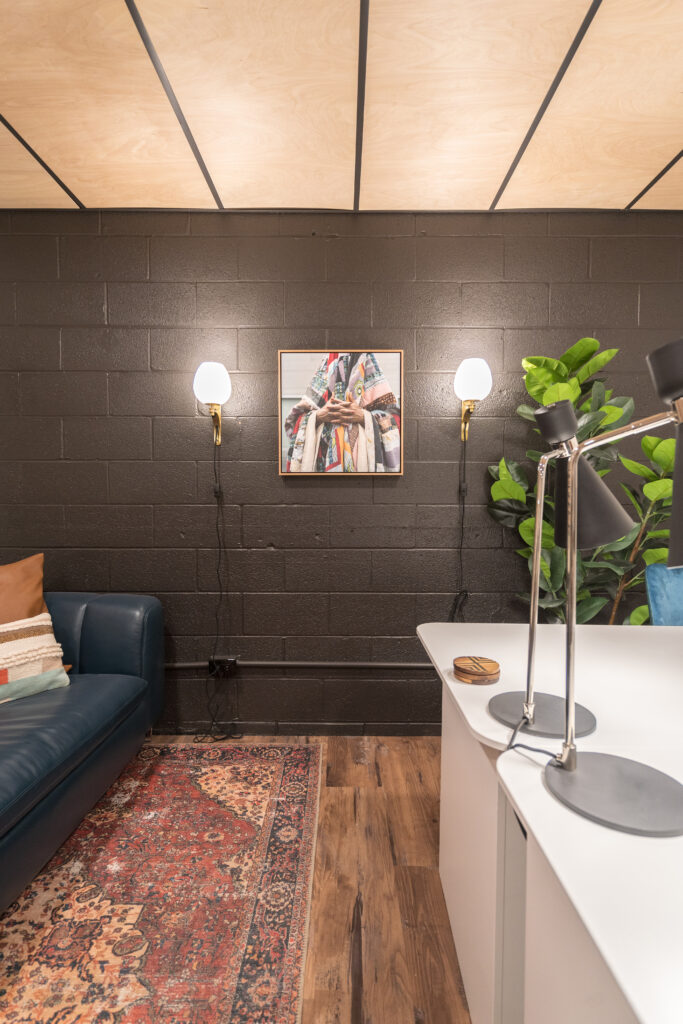
Let’s talk about a statement wall. When done right I can’t get enough of them. With that being said I do feel you need to be careful how you use statement walls. I personally do not feel you need them in every room or through out your entire space. You want the statement walls you create to feel special and unique, creating that true statement you intended it to! Here we used Sherwin Williams Armory on our Studio’s cinderblock wall to create a stunning backdrop for the art living on the wall!
I love how a dark gray can create a moody look! At its core it is very dark, and almost black, but in different light shows so many variants like it is chameleon. Here we use Sherwin Williams Iron Ore.
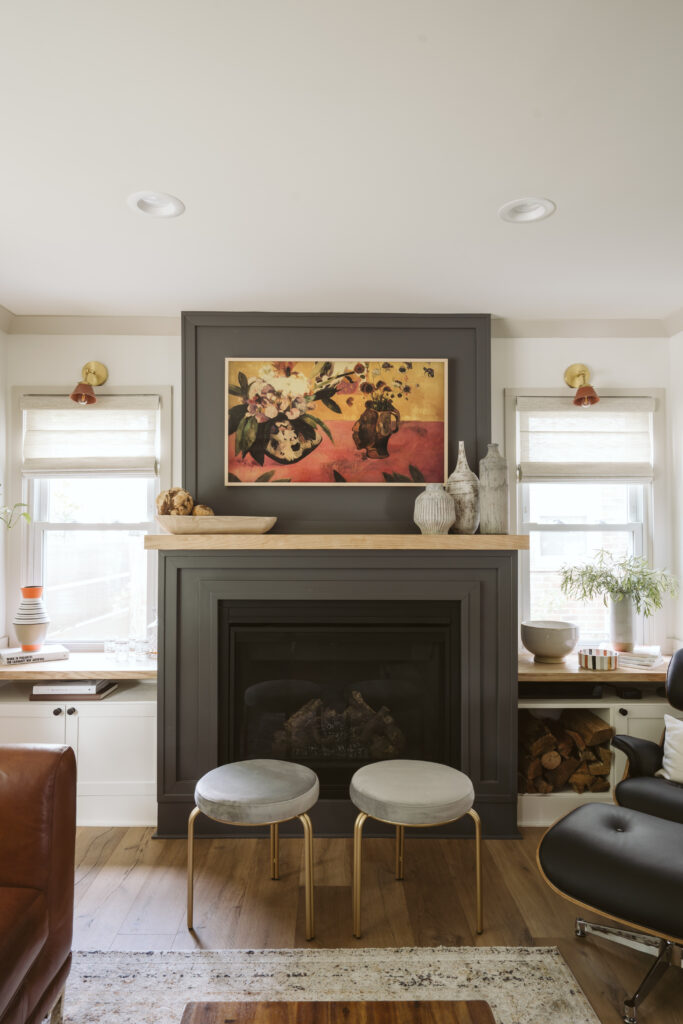
Peppercorn by Sherwin Williams makes a statement with it’s cool undertones and neutral coloring. Adding a fireplace with the additional moody transition here help set the tone of the space.
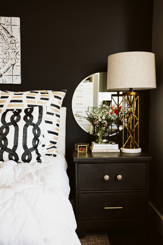
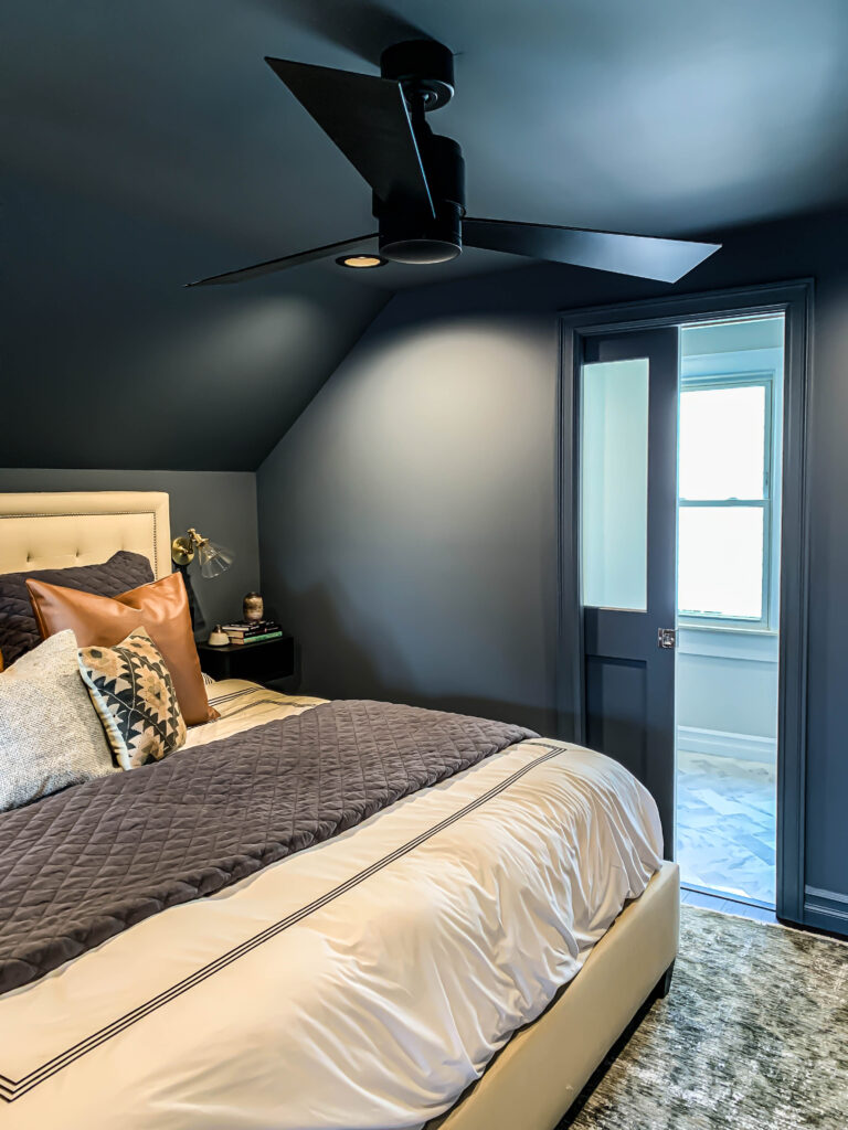
This moody bedroom was created using all Sherwin Williams Outerspace. The ceilings, walls and trim are all in Outerspace. The way we created depth was to use different paint sheens throughout! Giving a completely moody and dramatic feel!
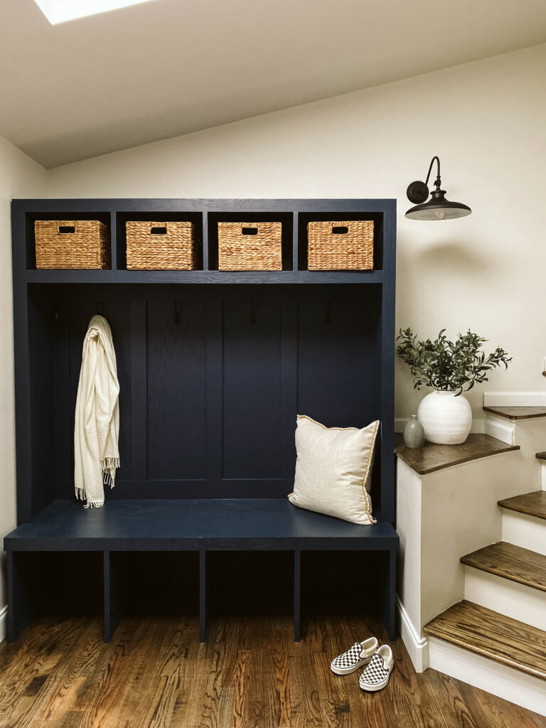
I couldn’t loop navy in with dark blue! Navy has it’s own unique feature. Here we use a classic Sherwin Williams Naval. Which reads as a classic navy in this space because of the beautiful natural sunlight! The Naval is the perfect statement for this mudroom space.
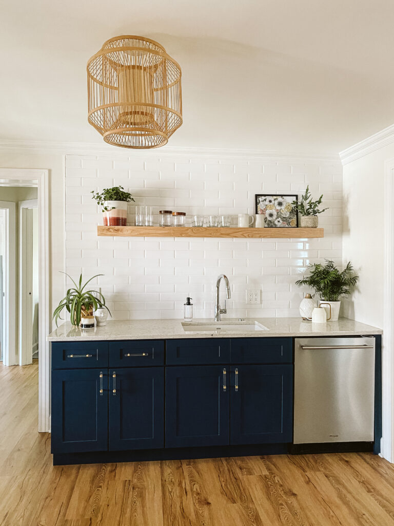
In the Navy by Sherwin Williams for cabinet colors creates such a fun statement. We paired it with an all white backsplash, neutral walls and a warm wood tone. Love the kitchenette we created here at Reset!
Much Love –
Co-Founder, Clark + Aldine
Clark + Aldine is fully licensed and insured.
© 2025 Clark + Aldine | Interior Design Websites by Formcode | Site Map · Privacy Policy · Terms and Conditions